Logo distortion
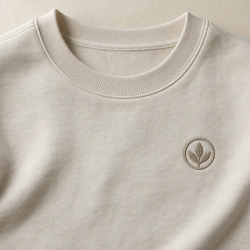
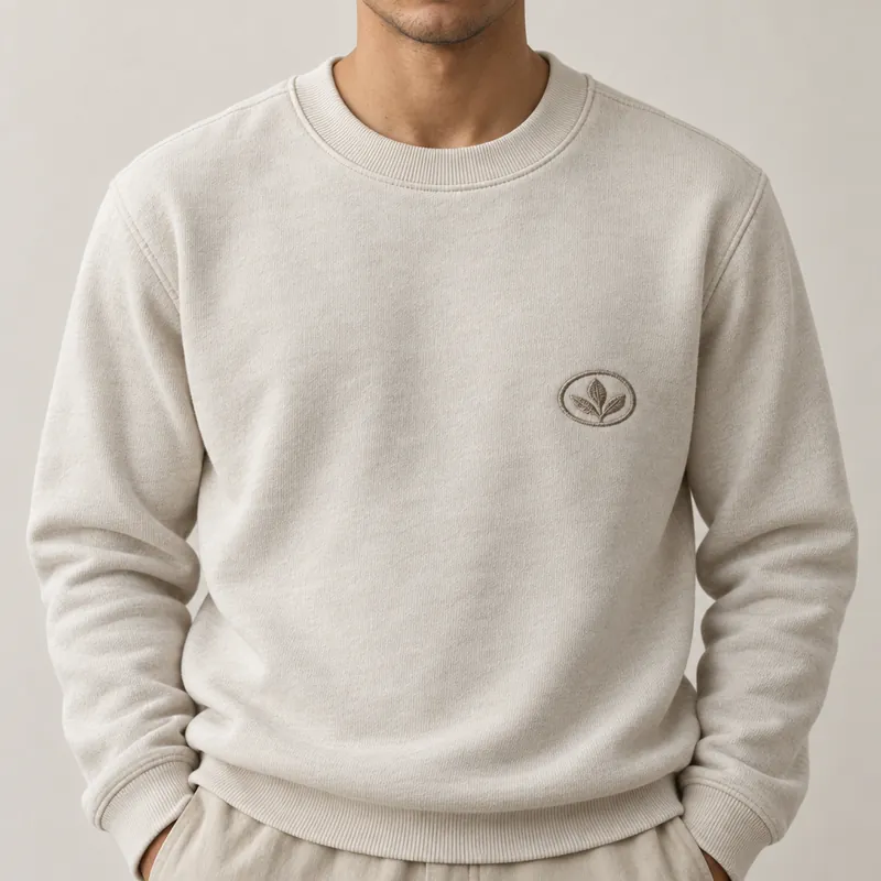
Logo distortion is a failure in generated fashion imagery where a logo, badge or lettering on a garment is redrawn: letters turn into near-letters, shapes change, or a mark moves or disappears.
Logo distortion is one of the easiest failures to spot and one of the most damaging to ship, because a logo is the brand's own signature on the product. Research on virtual try-on has named it for years: common methods capture a garment's overall look but fail to preserve detailed patterns, text and logos.
Where it shows up
- Chest logos and badges on tops and sweatshirts.
- Lettering on waistbands, straps and labels.
- Embroidered marks and small woven tabs, especially on denim.
- Logos on curved or folded fabric, where the generator has to redraw them in perspective.
How to catch it in review
Zoom to 100% on every logo in every image, and compare letter by letter with a close-up reference. Near-letters, a missing serif, a letter that turns into a shape, or a badge that moved a few centimetres are all rejects. Thumbnails hide this failure completely.
How to prevent it
- Supply a sharp, straight-on close-up of each logo as a reference, not only the full packshot.
- Plan poses that keep the logo visible and flat, instead of folded under an arm.
- When a logo fails, make the image again rather than retouching the letters in; patched lettering rarely matches the fabric's texture and light.
Part of garment fidelity. Related: print drift.